


Every neighborhood in America mapped to show risk levels of lead contamination in the water supply
Friday, August 19, 2016 by: Natural News Editors
Tags: lead contamination, water supply, American cities
(NaturalNews) Neighborhoods where kids face the highest risk of lead poisoning exist all across America.
The trouble is that exposure risk is surprisingly difficult estimate, due to a variety of state-by-state differences in reporting standards. So we worked with epidemiologists in Washington state to estimate risk levels in every geographic area in America.
(Article by Sarah Frostenson and Sarah Kliff, republished from http://www.vox.com)
"As a parent, I found it very alarming," says Holly Davies, who works in Washington's Department of Ecology on lead exposure reduction. "My son was born in West Virginia, and there it was standard practice that at one year they get screened [for lead poisoning risk]. But here it wasn't a standard thing; I was the one who had to bring it up."
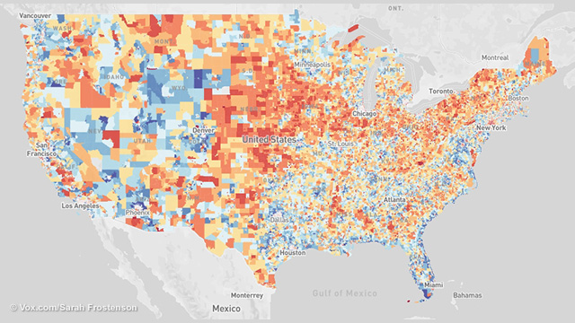
The map you'll see below shows the risk of lead exposure across the United States. The areas where kids are at highest risk of lead exposure — an estimate calculated using government data about the surroundings — are scattered all across the country.
These are the bright red areas in the map you see below — the places that public health researchers have identified as having the highest risk of lead exposure. You can see that the vast majority cluster in urban areas.
Where is the lead exposure risk in your community?
Vox worked with the Washington State Department of Health to map lead exposure risk nationally by census tract. We used housing and poverty data in our calculations to show areas of risk. These are not confirmed lead poisoning cases. (For interactive map of America please visit: http://www.vox.com/a/lead-exposure-risk-map)In some of America's oldest and largest urban areas, places like New York and Chicago, one in five census tracts — geographic areas that usually have between 1,200 and 8,000 people — have very high risks of lead exposure. (We use a scale of one to 10 we use in the map above; these areas rank as a 10.)
In younger metro areas, like Los Angeles, risks are smaller but still present; 12 percent of census tracts there have risk scores of 10. And it's important to remember that public health experts say no level of lead exposure is safe for children.
How we created this map
Our map uses a methodology that Washington State's Department of Health pioneered earlier this year to estimate kids' risk of lead exposure in different neighborhoods. Their mission was to determine how to focus scarce public health dollars on the kids most at risk of being poisoned by lead. We worked with one of the chief epidemiologists who created the map, Rad Cunningham, to replicate the state's methodology nationally and apply it to all 72,241 census tracts in the United States.The idea wasn't just to treat lead poisoning — the effects of lead exposure are often irreversible — but rather to use mapping tools to prevent exposure from happening in the first place.
To do this, researchers in Washington combed through the literature on lead poisoning to understand what factors best correlate with risk. They found that there were two — the age of the houses (which predicts the likelihood of lead paint) and poverty — that the literature consistently finds to be correlated with more kids coming into contact with lead.
"It's an extremely valuable tool," says Surili Patel, who is the American Public Health Association's senior program manager for environmental health. She has worked with Washington state, but not on this map. "I can see this helping the medical community and communities at risk understand where they are and why to pay attention."
Rob Walker, a public health official in Iowa who chairs the Center for Disease Control's working group on Environmental Health Tracking said that Washington's map uses "the best data available and a sound methodology" to create the risk scores.
Why it took so long to come up with a map like this
It can be frustratingly difficult — sometimes impossible — for a parent or even a public health researcher to find good data on where the risks of lead exposure are highest."We don't really know where the problem is; we don't know where to target our resources to protect kids," Bruce Lanphear, a professor at Simon Fraser University in Vancouver who studies the effects of low-level lead exposure in children, recently told Vox.
Cities and states aren't required to report data on how many kids have lead poisoning, or to even test all children for exposure. Flint's crisis earlier this year was unusually visual because of the unmistakable rust coloring the water, but lead normally isn't the type of toxin you can smell, see, or taste. It's different from secondhand smoke or air pollution in that it is invisible.
In lieu of consistent reporting standards, the country gets left with a hodgepodge of data. Different states have different standards; for example, because Washington and neighboring Oregon or Idaho have different standards for which kids they screen, it's difficult to compare lead exposure risk levels.
"You get to compare side by side, an apples-to-apples understanding," Patel of the APHA says of the national map. "It goes to the bigger picture of getting uniform data."
Urban areas have greater concentrations of risk, especially old industrial cities
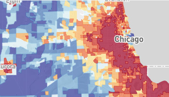
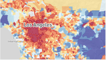
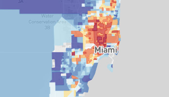
(Older industrial cities like New York and Chicago have a large percentage of areas with risk scores of 10. In New York City, 20 percent of areas have a risk of 10 and in Chicago, 23 percent of areas. But cities like Los Angeles and Miami have significantly fewer areas at risk. In Los Angeles, only 12 percent of areas have a risk of 10 and in Miami, only 2 percent.)States that do very little testing might show very few lead poisoning cases — which can create the appearance of safety but actually reflects a lack of data. Washington, for example, has had historically low levels of lead screening with only about 1 percent of all children there getting tested.
Cunningham and his colleagues built a map meant to show both parents and health providers the places where they should be most concerned about the possibility of kids experiencing lead exposure.
"The ultimate goal is to make sure we're testing the kids who need to be tested," Elisabeth Long, also an epidemiologist with Washington, says. "This helps us start taking public health actions, and prevent other kids from exposure."
Knowing about high-risk areas is important. But what are the side effects of knowing?
There are certain challenges that come along with discussing lead risk — and that might explain why it's an area that health departments have not approached aggressively.One is that high-risk scores don't correlate perfectly with an individual's chance of exposure. There are kids who live in the high-risk areas who might be just fine — they might live in a brand new house, for example — and children in low-risk areas who could still be harmed by exposure to lead.
"It's a hard message when you're talking about lead exposure," Long says. "And we don't want to be alarmist, but also [we want to] give more people more information about where they live."
Sometimes health departments can be reticent to single out a specific area as "high risk," as it could pose economic harm if other families or businesses don't want to move there.
"One worry you can have is about a domino effect, where businesses may decide to pull out in high-risk areas or real estate prices go up in the lower-risk areas," APHA's Patel says. She still thinks it's better to make this type of information public, even though it does carry some of these risks.
There are also limitations to how much epidemiologists can do to map risk. There are other factors that studies have associated with lead risk — whether there has historically been a local lead smelting plant, for example. But this map doesn't take that factor into account, because the data on where those plants are isn't as robust as data on poverty and housing age, which the federal government tracks closely.
While the data is relatively granular, pointing to how high the risk level in your specific geographic area might be, it still does not tell us which specific houses could expose children to lead.
"One challenge is that there is huge variability from neighborhood," says David Jacobs, chief scientist at the National Center for Healthy Housing. "What would be even more preferable is finding the exact houses where lead exists."
What this map tells us: Lead exposure risk is greatest in urban areas and less common in Western states
This map identifies the places where kids would experience the highest and lowest risks of lead poisoning. It does that by taking all 72,241 census tracts and assigning them a risk score between 1 and 10, based on how old the local houses are and the percentage of the population living in poverty.Each grouping represents 10 percent of the total number of census tracts, so within each risk level (all the dark blue census tracts with a 1, for example) there is some variation. But what this map does especially well, as Cunningham explained, is identify the hotspots for lead exposure.
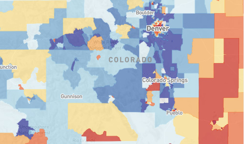
(Western states like Colorado have a greater percentage of areas with lower exposure to lead than states like Pennsylvania, but urban centers like Denver have pockets of risk.)A high risk score doesn't mean kids living there are certain to come into contact with lead or to even to become poisoned. But it does show that, given what we know about lead exposure, kids in these areas are more at risk for such contact.
Areas of the country with lower risk are typically located in less populated Western states like Nevada, Arizona, or Colorado, where more than 25 percent of the areas have a lead risk score of 1. But there are also Southern states like Florida and Texas, where more than 15 percent of the tracts have a lead risk score of 1.
On average, only 8 percent of census tracts, or geographic areas, in a state have a high risk of lead exposure. But there are four states — Rhode Island, New York, Ohio, and Pennsylvania — where more than 20 percent of the census tracts have a lead exposure risk of 10.
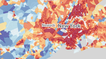
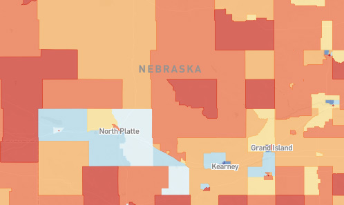
(In Nebraska, where more than a quarter of the state is rural, 92 percent of areas have a lead exposure risk of 6 or greater.)Of the 7,224 census tracts with lead exposure risks of 10 — the highest possible risk level — the vast majority, 92 percent, are located in urban areas. In New York and Chicago, about 20 percent of census tracts have the highest risk score.
Risks can be higher in some smaller cities, too. In small metro areas with populations under 2 million like Cleveland, Ohio, and Milwaukee, Wisconsin, more than 30 percent of all census tracts have a high risk of lead exposure. Even smaller cities with populations under 150,000 like New Bedford, Massachusetts, and Utica, New York, have high risks of lead exposure, with more than 40 percent of all census tracts at extreme risk.
There are also rural areas with high risks of lead exposure. While only 17 rural tracts have a lead exposure risk of 10, the highest risk, 55 percent of rural areas have lead exposure risk levels of 6 or greater. Some states with large percentages of rural census tracts, like Kansas and Nebraska, have large swaths of lead exposure risks. In Nebraska, 92 percent of rural areas have a lead risk exposure score of 6 or greater.
Read more at: http://www.vox.com
Sources:
[1] http://www.vox.com
[2] http://www.nytimes.com
[3] http://www.ncbi.nlm.nih.gov/pmc/articles/PMC1241046/
[4] http://www.vox.com
[5] http://www.vox.com/2016/1/21/10811004/lead-poisoning-cities-us


Lead contamination at FETCH.news
Get independent news alerts on natural cures, food lab tests, cannabis medicine, science, robotics, drones, privacy and more.

Take Action: Support Natural News by linking to this article from your website
Permalink to this article:
Embed article link: (copy HTML code below):
Reprinting this article:
Non-commercial use OK, cite NaturalNews.com with clickable link.
Follow Natural News on Facebook, Twitter, Google Plus, and Pinterest
- Is your shampoo harming your health?
- How to Use Organic Neem Leaf for Flea and Tick Control for Cats
- Folic acid proven to prevent heart disease and stroke in study
- Green tea extract may help prevent type-2 diabetes through improved glucose tolerance
- Gravity water filter scientific test results released by Natural News: Big Berkey, ProPur, Zen Water Systems and more
- Royal Rife: Cancer Cure Genius Silenced by Medical Mafia
- 11 common health symptoms hint at global depopulation 'slow kill'
- Sickening: Major food corporations use tissue from aborted babies to manufacture flavor additives in processed foods
- Fox News covers fake blueberries story uncovered by Health Ranger
- Chemtrails: Learn how to protect yourself from these treacherous poisons
- Beat cancer with 35% hydrogen peroxide
- Vivid dream: Health Ranger witnesses destruction of a 'Greek island' in America and a government-run cyber warfare false flag attack
- Groundbreaking investigation reveals Monsanto teaming up with US military to target GMO activists
- CDC admits, then retracts statistics reporting that 98 million Americans were injected with vaccines containing cancer virus
- Link between radiation exposure and first and second cancers exposed by researchers
- Grapefruit naturally prevents formation of kidney cysts
- Why does the mainstream media censor citizen science?
- Tips for an Unforgettable Raw Vegan Valentine's Day
- Green tea extract may help prevent type-2 diabetes through improved glucose tolerance
- Chemtrails: Learn how to protect yourself from these treacherous poisons
- Beat cancer with 35% hydrogen peroxide
- Inflammation is the cause of nearly all disease - Here's how to prevent it
- HEAL your thyroid: Health Ranger discloses water secrets, iodine science, natural cures and more in the Thyroid Connection Summit
- Royal Rife: Cancer Cure Genius Silenced by Medical Mafia
- The best and worst forms of magnesium to take as a supplement
- How to Use Organic Neem Leaf for Flea and Tick Control for Cats
- Flu vaccines causing massive spike in deaths of elderly across the UK, warn health officials
- Toddler injected with 37 vaccines before the age of two left paralyzed and wheelchair-bound for life
- The Great Culling has begun: Will your genetic lineage survive?
- Colorado Batman shooting shows obvious signs of being staged
- Indian black salve: The magical cancer cure
- How laetrile or B17 from apricot seeds kills only cancer cells
- Ultimaker 2 3D printer review: These are NOT the droids you're looking for
- Zeolite truths, myths, benefits and exaggerations... explosive interview with zeolite expert blows the lid on what's REAL vs. BOGUS
- Gravity water filter scientific test results released by Natural News: Big Berkey, ProPur, Zen Water Systems and more
- Heal Yourself in 15 Days by Cleaning Up Your Skin Exposure (Part Ten)
- Vaccine mafia earns 'F' in science: Australian Health Minister utters the most insanely stupid anti-science statement ever recorded... 'no risks in vaccinating children'
- The United Nations 2030 Agenda decoded: It's a blueprint for the global enslavement of humanity under the boot of corporate masters
- The best and worst forms of magnesium to take as a supplement
- Colorado Batman shooting shows obvious signs of being staged
- Vaccinated children have up to 500% more disease than unvaccinated children
- What's really in vaccines? Proof of MSG, formaldehyde, aluminum and mercury
- NASA admits to spraying Americans with poisonous chemtrails
- The real vaccine scam is not that they cause autism, but that they don't even work!
- The MMR vaccine, autism connection
- New NASA research points to possible HAARP connection in Japan earthquake, tsunami
- Beat cancer with 35% hydrogen peroxide
- NASA gives thumbs up to use of colloidal silver as antibiotic in space; FDA has no jurisdiction in high orbit
- Green tea extract may help prevent type-2 diabetes through improved glucose tolerance
- Reverse and eliminate cataracts naturally without surgery
- Inflammation is the cause of nearly all disease - Here's how to prevent it
- Bicarbonate of Soda Used to Cure Stage Four Prostate Cancer
- Anti-foaming agent found in Chicken McNuggets
- Flu vaccines causing massive spike in deaths of elderly across the UK, warn health officials
- The Coming Gold Revaluation: Strategic Financial Realignment in an Era of Dollar Collapse
- The AI Data Center Wars Have Begun… Farms, Water and Electricity is Stripped from Humans to Power the Machines
- Urgent Wake-Up Call: The Coming AI Robot Wars and the Great Human Unity
- Eleven days before Iran bombed Tel Aviv, my microscope revealed haunting images of EXACTLY what would happen
- The War on Light: How Governments and Big Pharma Keep You Sick By Blocking Healing Photons
- DECENTRALIZED SPIRITUALITY and the true teachings of Christ: Overcoming the censorship, threats and lies of organized religion to truly know God and the Universal Christ
- THE AI RACE IS ALREADY WON: How China’s power dominance (and America’s climate lunacy surrender) secured its victory in the race to AI superintelligence
- Why the U.S. Government May be Seeking to Slaughter 200 Million Americans to Free Up Excess Power for AI Data Centers and the Race to Superintelligence
- Trump's Trojan Horse: How Stablecoins Are Secretly Paving the Way for a CBDC Control Grid – an Interview with Catherine Austin Fitts
- EXCLUSIVE REPORT: The Trump-Putin Meeting in Alaska - A Historic Pivot that Redefined Global Power
- Morphic resonance “remote viewing” reveals iconic Middle East images of stealth bombers, a falcon and a one-horned ram
- 18 MILLION COVID-JABBED Japanese folks shown to have SIGNIFICANTLY HIGHER DEATH RATES during first year after injection with mRNA clot shots
- AI & economic liberty: Will decentralized tech save human autonomy?
- HEALTH SECRETS: How to Instantly Block MSG Toxicity Using Natural Substances (and the secret of Methylene Blue)
- Franken-butter: Startup backed by Bill Gates creates butter from thin air
- BOMBSHELL: Internal Pfizer documents exposed and reveal at least 16 PERCENT of their mRNA vaccine "adverse events" are REPRODUCTIVE DISORDERS
- BOMBSHELL: DNA testing kits are a SCAM to develop ethnic-specific bioweapons
- How a nasal spray vaccine could turn Americans into walking bioweapons this Fall

Science News & Studies

Medicine News and Information

Food News & Studies

Health News & Studies

Herbs News & Information

Pollution News & Studies

Cancer News & Studies

Climate News & Studies

Survival News & Information

Gear News & Information

News covering technology, stocks, hackers, and more


"Big Tech and mainstream media are constantly trying to silence the independent voices that dare to bring you the truth about toxic food ingredients, dangerous medications and the failed, fraudulent science of the profit-driven medical establishment.
Email is one of the best ways to make sure you stay informed, without the censorship of the tech giants (Google, Apple, Facebook, Twitter, YouTube, etc.). Stay informed and you'll even likely learn information that may help save your own life."
–The Health Ranger, Mike Adams